Graphs and Data Logging
Here you can see how graphs work in Evolo, how to change the time period, export data, and filter out noise in measurement values.
Written By Evolo Support
Last updated 5 days ago
How the graphs work
Graphs are used to display historical data from the building.
The X-axis shows time
The Y-axis shows the logged values
A graph can display one or more data sets at the same time
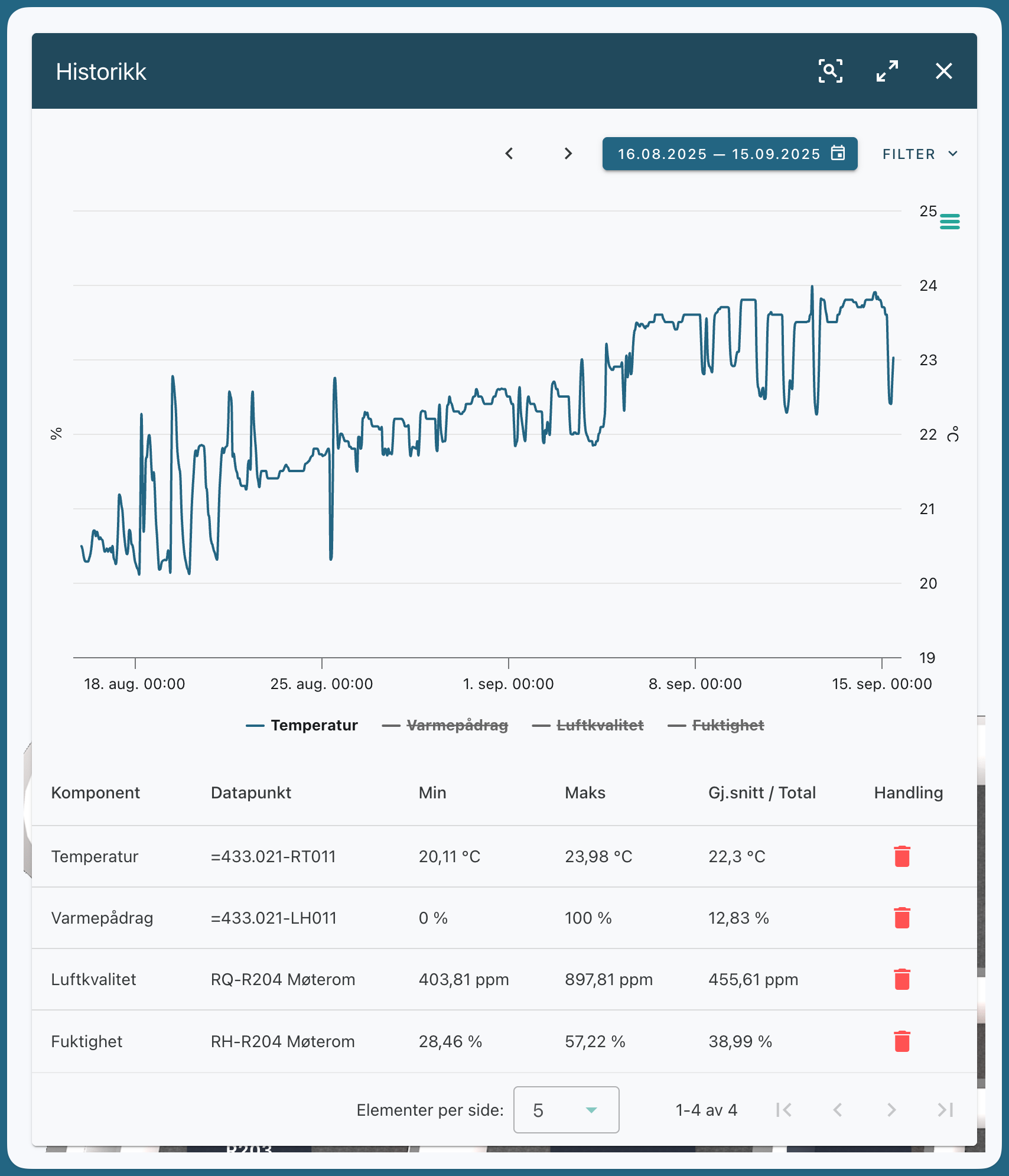
Multiple data sets in the same graph
Evolo automatically distributes the data sets across the Y-axes:
Data sets with the same unit, such as percentages or degrees, are plotted on the same Y-axis
Data sets with different units are distributed on separate sides
If the chart has more than two data sets, the system selects which units to assign to the axes based on which unit appears most frequently
A chart can have only two Y-axes
. Therefore, if you display many datasets with different units at the same time, some of them may be harder to read on the axes.
When data points are missing
If a data point is missing, the system automatically fills in the value.
This is done using linear interpolation. This means that the system calculates a value based on the points before and after, so that the graph remains continuous.
How do I change the time period?
Here’s how to change the period in the graph:
Open the graph
Click the data selector
Select the desired time period
If necessary, select the resolution, such as day, week, or month
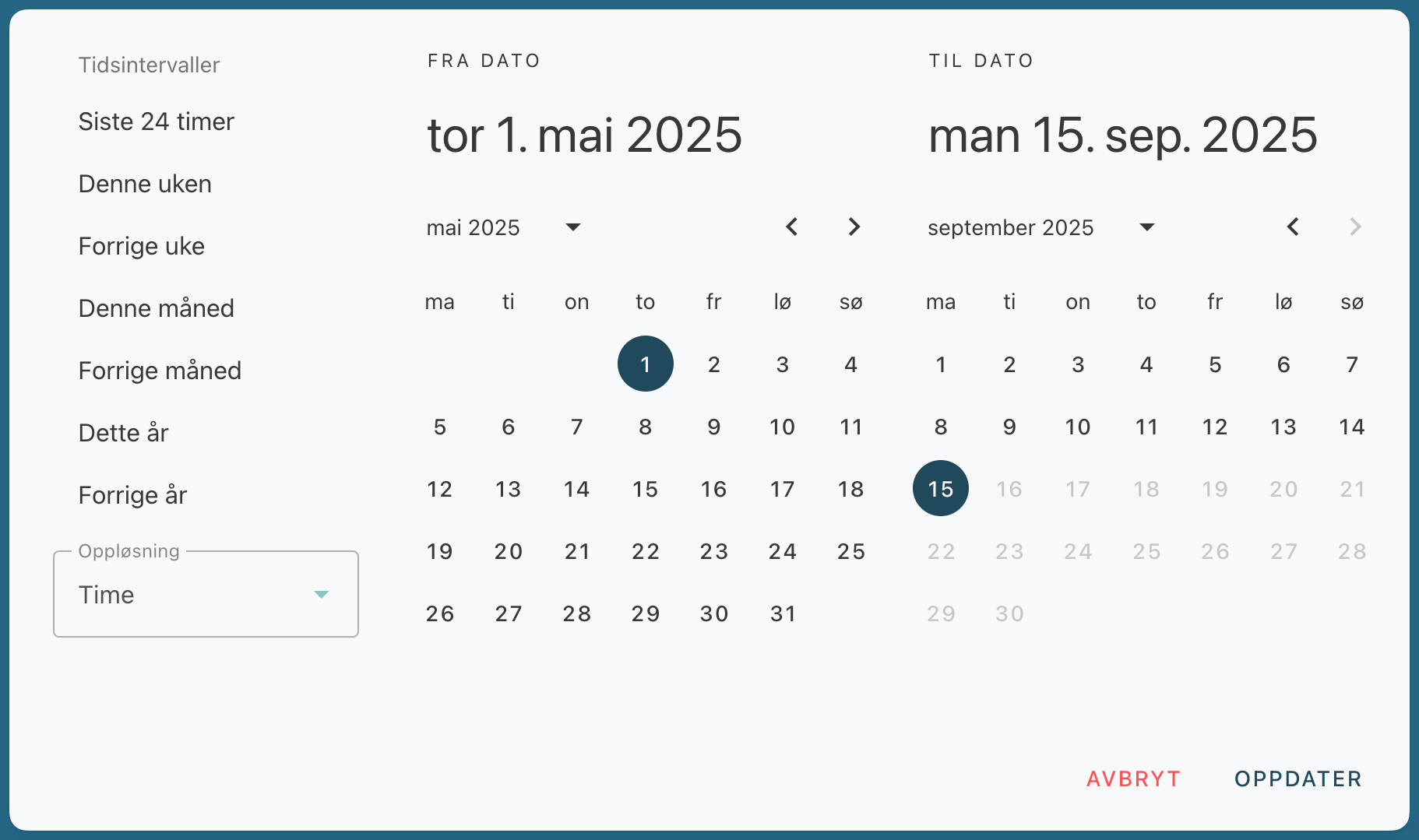
Download or export the data
To export the graph or the data:
Open the graph
Click the menu in the chart
Choose whether you want to download the chart or export the dataset
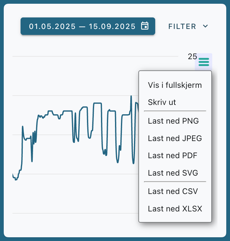
You can download in these formats:
SVG
PNG
CSV
XLSX
Filter out noise in the data
If the dataset contains noise—such as negative values that shouldn’t be there—you can use the filter function.
Here’s how the filter works
Select the percentage of data that is presumed to be incorrect
Specify a correction factor
The system removes the outliers in the dataset—that is, the highest and lowest values within the selected percentage
The remaining values are then used to determine what constitutes valid levels
Values outside this range are marked as invalid
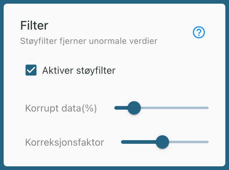
What happens to invalid values
Once the filtering is complete:
invalid values are replaced with a red dot
The dot is set to the average of the valid values
You can hover your mouse pointer over the dot to see which value was filtered out
Frequently Asked Questions
I can't view graphs or history?
I can't view graphs or history?
Make sure the date, time, and time zone are set correctly on your Gateway.
Does the graph look strange or contain jumps?
Does the graph look strange or contain jumps?
Data points are missing, or the dataset contains noise. Check the current logged value and consider deleting the history.
The trend isn’t displayed when I hover over a value?
The trend isn’t displayed when I hover over a value?
The trend shows the history of the data point, so it only appears for data points that are being logged. Enable logging for the data point under Configuration and Logging; see Add logging for a data point. Also check that “Show Trend” is enabled in the toolbar on the right side of the view. The trend isn't displayed on mobile.
Was this helpful?
Still need help? Ask the team