View energy data hierarchically in a pie chart
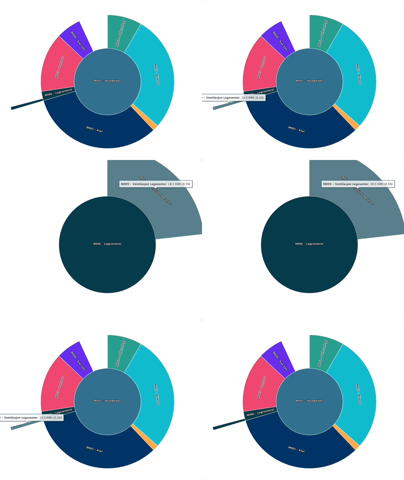
In Evolo, you can display energy data hierarchically in a pie chart. This provides a visual overview of how energy consumption is distributed among the main meter and submeters.
Written By Evolo Support
Last updated 2 months ago
How the display works
If the system has one main meter and one or more submeters, Evolo displays energy data in a pie chart. The main meter is shown in the center, and the submeters are shown in the rings around it.
When the pie chart is not displayed
The pie chart is not displayed if:
the main meter is less than 1
the sum of the sub-meters is greater than the main meter × 2
Important to Note
If the graph is not displayed, the data typically does not meet the requirements for the graph.
Check the value of the main meter and the sum of the submeters.
Was this helpful?
Still need help? Ask the team