What is an ET curve?
Use the ET curve to obtain a graphical representation of the facility's energy consumption at various outdoor temperatures.
Written By Evolo Support
Last updated 2 months ago
E stands for energy, and T stands for temperature. An ET curve shows how much energy a building consumes at different outdoor temperatures.

Explanation of the graph
The X-axis shows the average temperature for the selected period.
The Y-axis shows energy consumption in kilowatt-hours (kWh).
Blue dots show energy consumption per day, week, or month, depending on the period you’ve selected.
Yellow points indicate that the point has an associated comment.
Red points indicate energy consumption that deviates from the ET curve.
The green line shows expected energy consumption, calculated based on data from the last 365 days.
Green outer lines: show deviations in percent or kWh. These can be adjusted in the settings.
The blue points should be as close to the green line as possible. If a point falls outside the green outer lines, this indicates a deviation from expected consumption.
Example of a deviation
Lower consumption may be due to vacations.
Higher consumption can occur due to unusual activity in the building, such as large events or other additional use of the facilities.
Over time, the system collects more data and automatically improves its calculation of expected energy consumption. This results in a more accurate ET curve.
Curve settings
Linear regression
Creates a linear curve that best fits the data set.
Shows an approximate average consumption relative to the outdoor temperature.
Well-suited for systems without cooling, where energy consumption typically decreases as it gets warmer outside.
Polynomial Regression
Uses a cubic equation to fit the dataset more accurately.
Produces a curve with inflection points that may change direction if consumption increases at higher temperatures.
Consumption Limit
Adjust the percentage or fixed consumption limit in the graph.
At 0%, there is no margin of error, and you get a single, unified curve with no deviations.
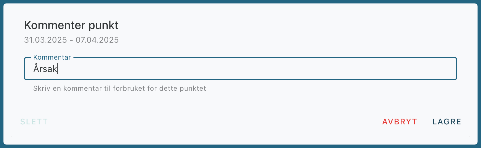
Add a comment
Click on a point in the graph to add a comment.
Curve settings
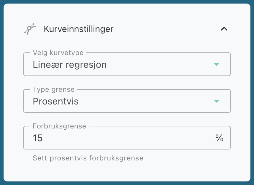
Linear regression
Creates a linear curve that best fits the dataset.
Represents the approximate average consumption in relation to the outdoor temperature.
Well-suited for facilities without cooling, where energy consumption typically decreases as it gets warmer outside.
Polynomial Regression
Uses a cubic equation to fit the data set more accurately.
Produces a curve with inflection points that may change direction if consumption increases at higher temperatures.
Consumption Limit
Adjust the percentage or fixed consumption limit in the graph.
At 0%, there is no margin of error, and you get a single, unified curve with no deviations.
Add a comment
Was this helpful?
Still need help? Ask the team